Qué drama.
>>
Netflix
>> Netflix
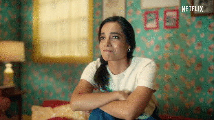
Task from Netflix: Create extra vocal branding that colorfully represents the most over-the-top genre of Latin America storytelling : Telenovelas. Yeah, just Netflix’s expansive collection of Novelas that’s wickedly melodramatic, gorgeous and addicting. Oh and also, make it cheeky way, you know…with a wink.
Qué drama.
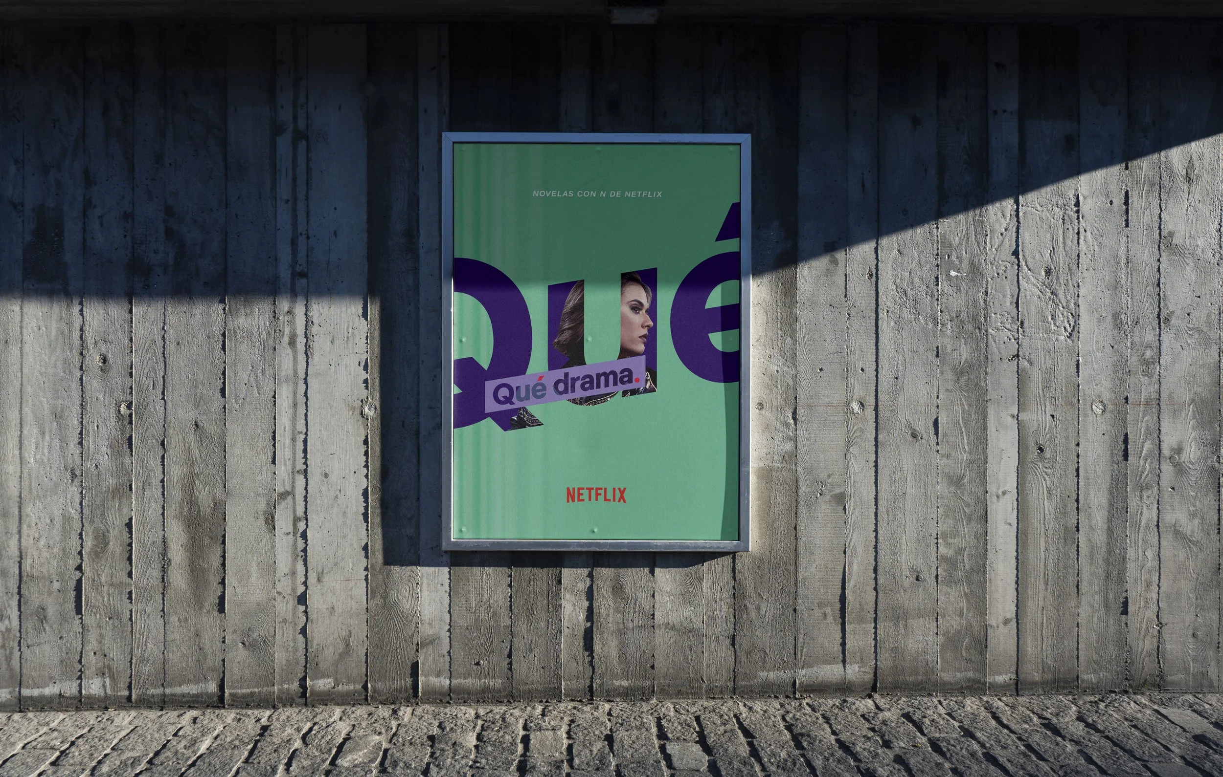
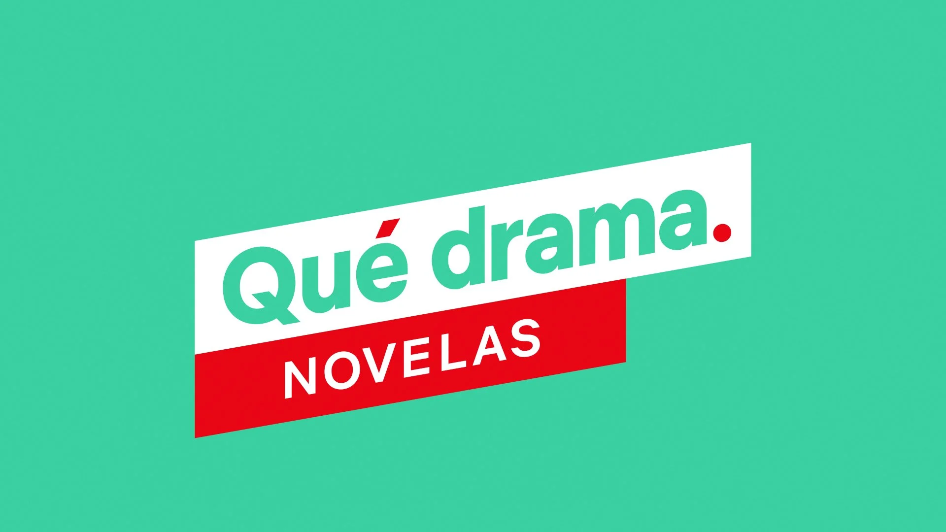
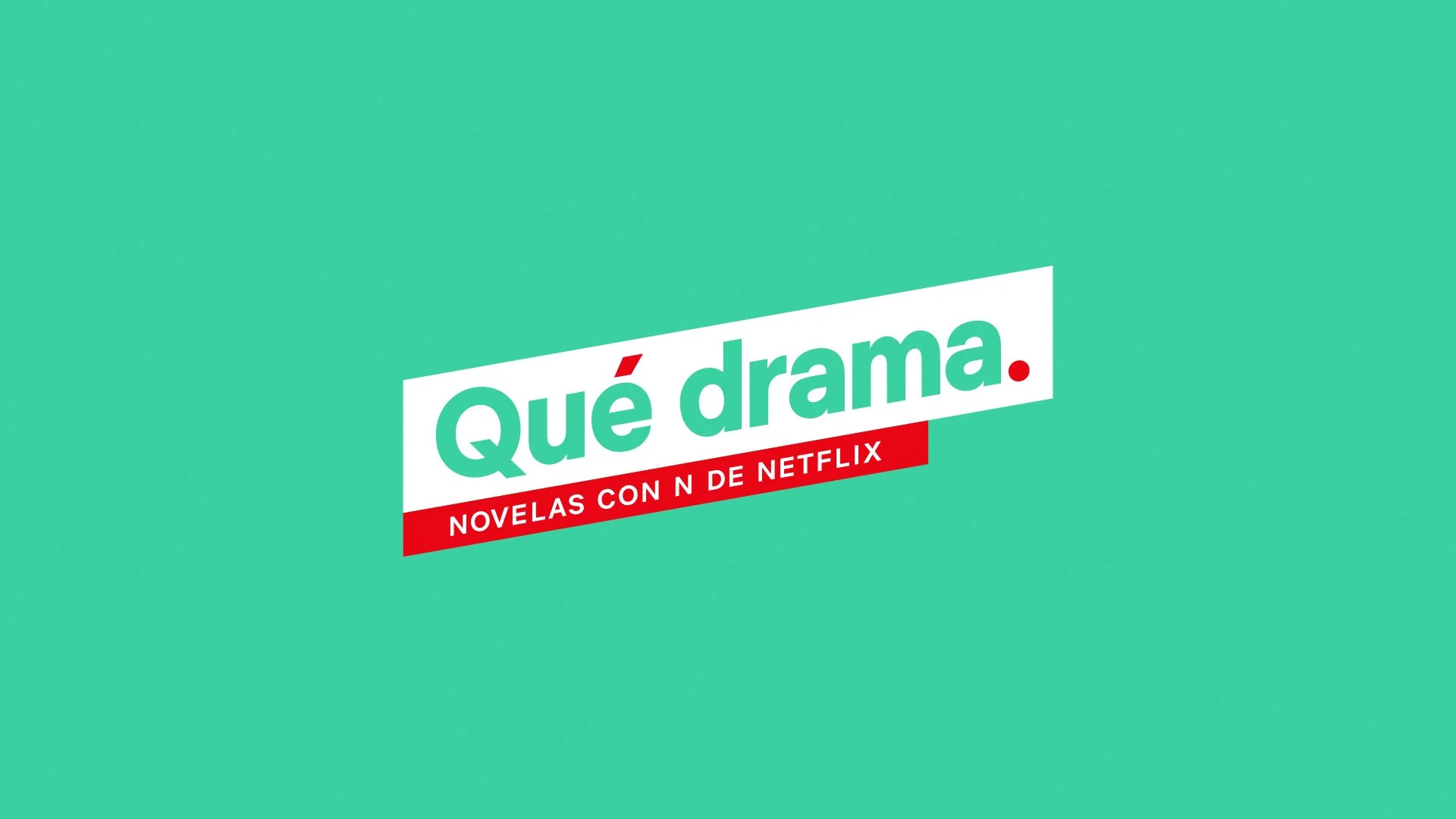
Taking a cue from brash tabloids that specialize in speaking loudly, we customized and hyperbolized Netflix’s existing design system. Our extra-bold custom logo design acts dually as a colorful branding badge and a deliberate portal to extraordinary Qué drama content. Flooded with a pop-inspired palette, the branding flourishes across streaming, social and OOH.
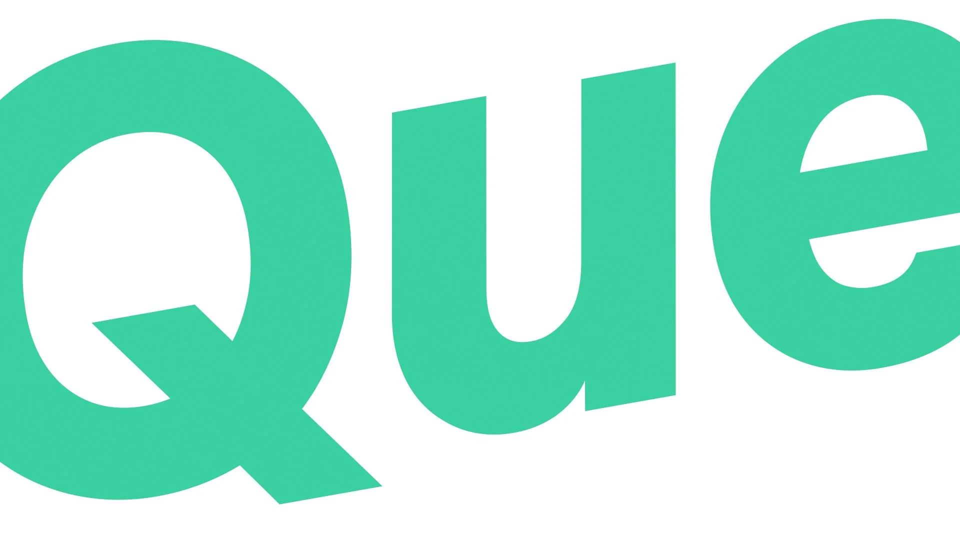
Typeset initially Netflix Sans via established brand guidelines. Then employing italics for emphasis - we made a custom extra-bold weight of italic that sets it apart from the font, while still tied to Netflix’s brand style. Next, a container furthers the sensational tabloid vernacular. Finally, the whole mark was rotated -10.08° to match the angle of the italicized forms. The letterforms retain plumb verticals for optical harmony.
My role: Creative director and cheerleader of all things design and drama.
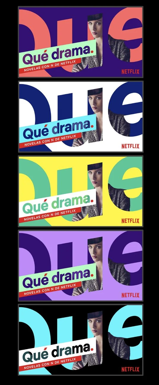
Qué drama OOH colorways.
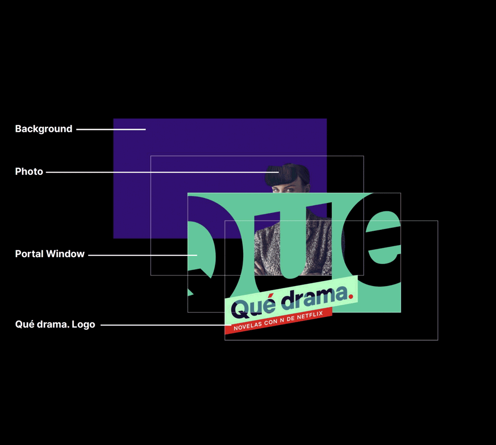
The Qué drama logotype used as a large cropped window / portal to frame photography or key art.

Mnemonic over color flood, drama.
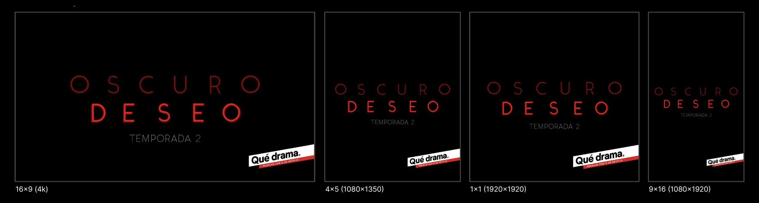
Badge usage for content.
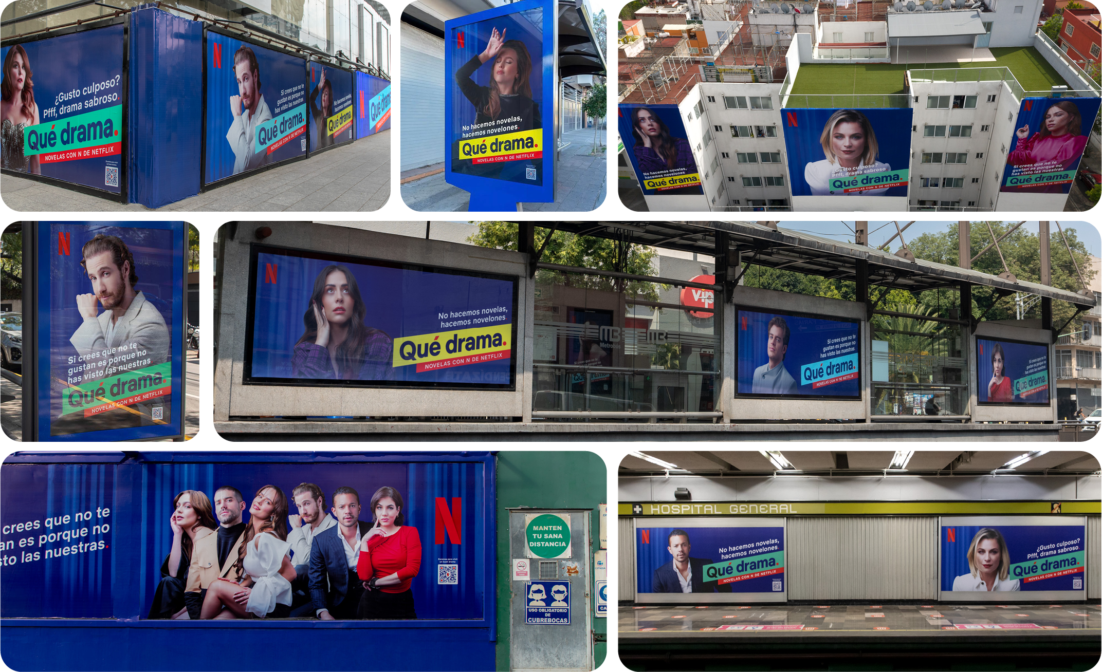
OOH in action.
Design exploration.
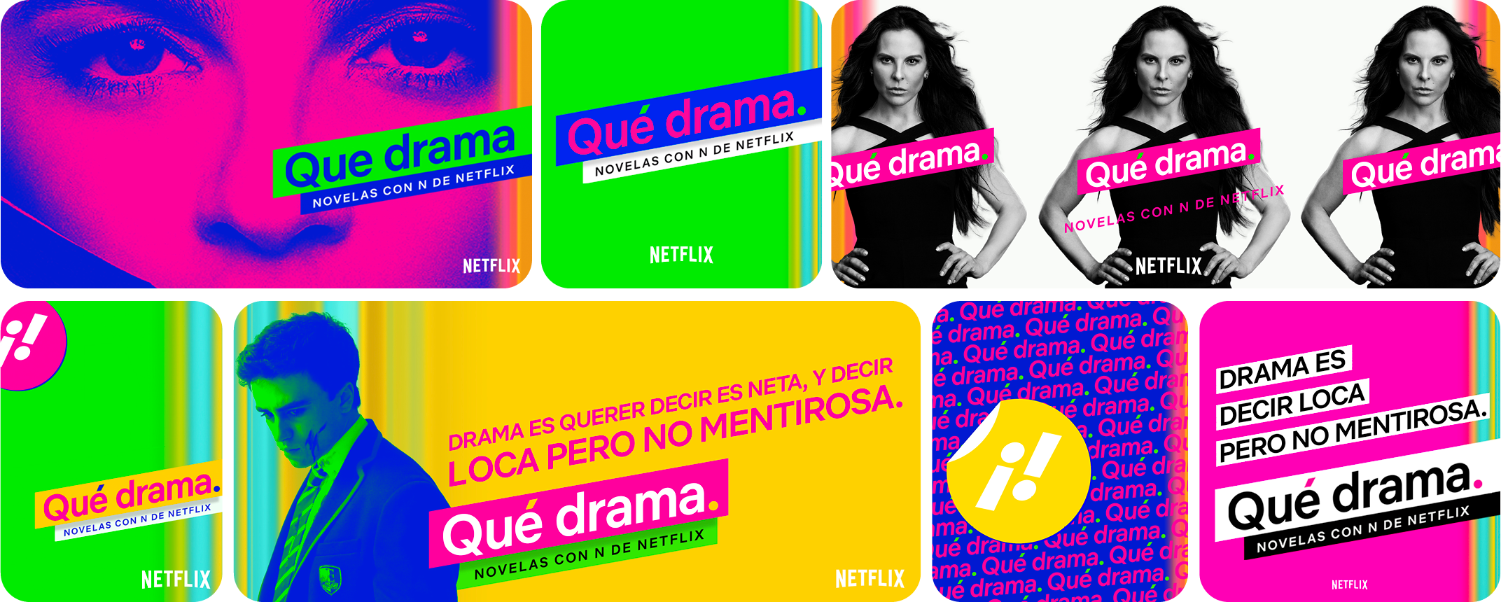
Design explo: Variable width typemark & ombre. Abandoned.
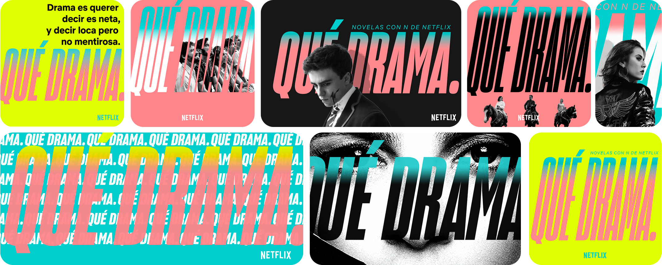
Design explo: Day-glo, stickers & gradient-mapping. Abandoned.
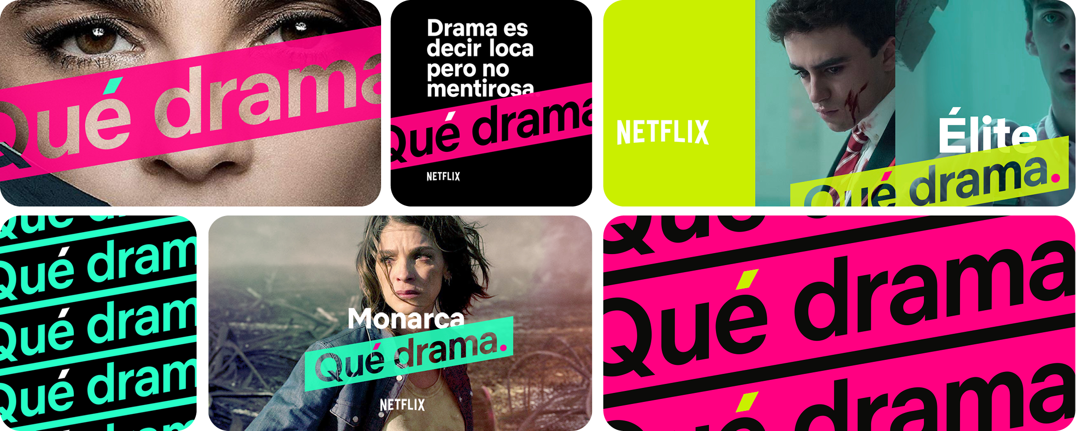
Design explo: Portal mark, oversize logo & crops. Refined towards final.
-
Client: Netflix, Latin America
Agency & Design Studio: MOCEAN
VP, Branding & Design: Jennifer Holstein
VP, Client Partnership: Amy Palmer
ECD, Design: Elaine Cantwell
ECD, Key Art: Kishan Muthucumaru
CD: Justin Leibow
Producer: Nora Jurasits
Designer: Justin Leibow
Designer: Carla Dasso
Designer: Natalie Huynh
Animator: Jessica Dafcik
Animator: Natalie Huynh